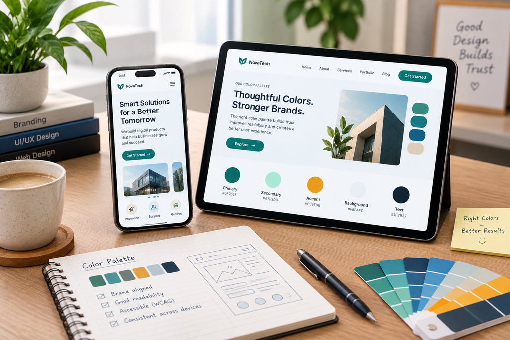
Choosing colors for a business website is not simply a matter of picking your favorite blue, green, or orange. A professional website color palette needs to support the brand, make content easy to read, create a clear visual hierarchy, distinguish interactive elements, and work across desktop and mobile screens.
The right color scheme should also consider accessibility. WCAG 2.2 includes requirements for text contrast and says that color should not be the only way information or actions are communicated. For normal text, WCAG’s AA criterion requires a contrast ratio of at least 4.5:1, while large text requires at least 3:1.
The best approach is therefore to build a purpose-driven color system rather than selecting several attractive colors and hoping they work together.
What Makes a Website Color Palette Look Professional?
A professional website color palette is usually recognizable because its colors have defined roles.
Instead of treating every color as equally important, assign colors to specific functions:
- Primary color: represents the brand and major actions.
- Secondary color: supports the primary brand color.
- Accent color: draws attention to selected elements.
- Background colors: create visual separation between sections.
- Text colors: provide readable headings and body copy.
- Functional colors: communicate states such as success, warning, or error.
This approach prevents a common design problem: using too many unrelated colors throughout the interface.
For example, if your primary brand color is dark blue, you might use a lighter blue for secondary surfaces, a neutral background for most content, dark gray for body text, and a contrasting accent for selected calls to action.
The exact colors will depend on the business. A financial company, creative agency, restaurant, technology company, and children’s brand do not necessarily need the same visual language.
1. Start With Your Brand, Not a Color Trend
Before selecting HEX codes, determine what the website needs to communicate.
Ask:
- What does the business sell?
- Who is the target customer?
- What personality should the brand communicate?
- Is the business formal, approachable, technical, premium, energetic, or playful?
- Does the company already have established brand colors?
- Where will the colors be used outside the website?
If the company already has a logo, packaging, social media identity, advertisements, or printed materials, the website should generally work with that existing identity rather than creating a completely unrelated palette.
Your website should feel like part of the same brand.
This is particularly important for businesses that receive visitors from multiple channels. Someone arriving from a social media profile or advertisement should not feel as if they have landed on a completely different company website.
If your site currently has attractive colors but still feels disconnected from the brand, the broader issue may be consistency. This is one reason [INTERNAL LINK: Why Does My Website Still Look Unprofessional Even Though I Have a Modern Design?] is useful when reviewing a site’s overall visual quality.
2. Choose a Primary Brand Color
Your primary color is the foundation of the palette.
It may come from the existing brand identity or be selected specifically for the website. The important point is to decide what role the color will play before applying it everywhere.
For example, a primary color might be used for:
- Logo elements
- Primary buttons
- Important links
- Selected navigation states
- Key headings or visual accents
- Branded illustrations
However, using the primary color on every element can weaken its ability to attract attention.
If every heading, button, border, icon, and background uses the same strong color, nothing stands out.
A better approach is to reserve stronger brand colors for places where they have a clear purpose.
3. Build the Palette Around Neutrals
Professional websites often need more neutral colors than brand colors.
White, off-white, light gray, dark gray, and near-black can provide the visual space needed for the main brand color to work effectively.
For example, a business website might use:
- Off-white for the main page background
- White for cards
- Dark charcoal for body text
- Medium gray for secondary text
- Brand blue for buttons and selected elements
- A contrasting accent for specific calls to action
This creates a visual hierarchy without requiring a different color for every section.
Neutral colors are particularly useful because they allow photographs, products, illustrations, headings, and calls to action to receive attention without making the entire page visually loud.
4. Check Contrast Before You Approve the Palette
A color combination can look excellent in a design file and still be difficult to read on an actual screen.
This is why contrast should be tested rather than judged only by appearance.
WCAG 2.2’s Level AA contrast requirements specify at least 4.5:1 for normal text and 3:1 for large text. User-interface components and graphical objects that convey information also have a 3:1 contrast requirement under WCAG’s non-text contrast criterion.
For example, light gray text on a white background may look elegant in a mockup but can be difficult to read. Increasing the darkness of the text can preserve a minimalist appearance while improving readability.
MDN also notes that contrast depends on the luminance of foreground and background colors, not simply whether two colors appear visually different.
Use a contrast checker during the design process instead of waiting until development is complete.
5. Do Not Use Color as the Only Way to Communicate
Color should support information, not carry the entire meaning by itself.
For example, a form should not communicate errors only by turning a field border red. A user with certain color-vision deficiencies may not distinguish the red from the surrounding colors.
Instead, combine color with another indicator such as:
- Error text
- An icon
- A visible label
- A symbol
- A change in border or shape
- Clear instructions
WCAG specifically addresses this through its Use of Color criterion, which says color should not be the only visual means of communicating information, an action, a response, or a distinction.
This principle applies to navigation, forms, charts, alerts, pricing interfaces, dashboards, and interactive components.
6. Choose an Accent Color Carefully
An accent color should have a job.
For example, an accent might be reserved for:
- A special promotional message
- A secondary CTA
- Important highlights
- Selected navigation states
- Limited visual emphasis
If you use the accent color everywhere, it stops functioning as an accent.
Consider a website with dark blue as its primary color and bright orange as an accent. If orange appears on every icon, heading, button, badge, border, and illustration, visitors will stop interpreting it as a meaningful visual signal.
Instead, use it selectively.
This creates stronger visual hierarchy without adding more colors.
7. Make Your Buttons Easy to Understand
Color plays an important role in distinguishing primary and secondary actions.
A primary CTA should generally have stronger visual prominence than a secondary action.
For example:
Primary: Get Started
Secondary: Learn More
The primary button might use the brand color, while the secondary action could use an outlined or lower-emphasis treatment.
The exact styling depends on the interface, but the relationship should remain consistent throughout the website.
Do not use five different button colors for five different sections unless those colors communicate meaningful differences.
A consistent button system makes the interface easier to understand.
8. Consider Your Industry Without Copying Competitors

Industry conventions can influence color choices, but they should not dictate them completely.
A healthcare company may need a visual identity that feels clean and trustworthy. A technology startup may choose a more expressive palette. A luxury brand may use restrained neutrals and carefully controlled accent colors.
The mistake is copying a competitor’s colors simply because their website looks successful.
Instead, examine what visual expectations customers have in your industry and then determine how your brand can remain recognizable.
The goal is appropriate differentiation, not visual isolation.
9. Test the Palette With Real Website Content
Never evaluate a color palette only using blank design boxes.
Put real content into the design.
Test:
- Long paragraphs
- H1 and H2 headings
- Product cards
- Forms
- Navigation
- Buttons
- Links
- Pricing sections
- Testimonials
- Images
- Footer content
- Error and success messages
A palette that looks excellent on a hero section may fail when used for long-form text or forms.
Also test the colors at different screen sizes and brightness levels. MDN notes that environmental conditions, screen characteristics, text size, font style, and surrounding colors can affect how colors are perceived.
10. Check the Palette on Mobile
A color palette does not exist independently from the layout.
On mobile, buttons may occupy more space, sections may stack vertically, and backgrounds may become more visually dominant because the screen is smaller.
A color combination that feels balanced on a wide desktop layout can become overwhelming when large colored sections occupy most of a phone screen.
For that reason, review your colors together with responsive layouts rather than treating desktop and mobile as separate design projects.
If your website’s appearance changes significantly between devices, the issue may involve more than colors. [INTERNAL LINK: Why Does My Website Look Good on Desktop but Poor on Mobile?] covers the broader responsive-design problems that can affect the mobile experience.
11. Create a Simple Color System for Developers
Once the palette is approved, document it.
Do not leave developers to guess which blue belongs to buttons and which blue belongs to backgrounds.
Define variables or design tokens such as:
Primary
Primary Hover
Secondary
Accent
Background
Surface
Text
Muted Text
Border
Success
Warning
Error
The exact implementation can vary depending on the technology, but the principle is the same: each color should have a defined purpose.
This makes future changes easier. If the brand changes its primary color, developers can update the central color token instead of searching through hundreds of individual styles.
12. Review Color With the Rest of the Design System
Color cannot compensate for poor typography, inconsistent spacing, or a confusing layout.
A professional website needs these elements to work together.
For example, a sophisticated navy-and-gold palette can still look unprofessional if cards have inconsistent padding, headings are randomly sized, buttons use different shapes, and sections do not align.
If you are selecting colors as part of a broader redesign, it is worth reviewing the relationship between color and layout. Problems involving inconsistent margins, alignment, and component spacing are addressed in [INTERNAL LINK: How Can I Fix Poor Spacing, Alignment, and Layout Problems in My Website Design?].
A Practical Process for Choosing Your Website Color Palette
If you are starting from scratch, use this sequence:
Step 1: Identify the brand personality
Write down three to five characteristics the website should communicate.
Step 2: Review existing brand assets
Collect the logo, brand colors, marketing materials, packaging, and social media graphics.
Step 3: Select the primary color
Choose the color that represents the core identity of the business.
Step 4: Add supporting colors
Create secondary and accent colors that work with the primary color rather than competing with it.
Step 5: Build neutral colors
Define background, surface, body-text, muted-text, and border colors.
Step 6: Test contrast
Check text/background combinations against WCAG requirements.
Step 7: Apply the palette to real components
Test buttons, cards, navigation, forms, headings, links, and alerts.
Step 8: Test accessibility
Make sure information is not communicated through color alone.
Step 9: Test desktop and mobile
Review the actual interface at multiple screen sizes.
Step 10: Document the system
Give every color a role so future pages remain consistent.
How Many Colors Should a Professional Website Have?
There is no universal rule saying that a professional website must contain a specific number of colors.
What matters is whether the colors have clear roles and whether the overall system remains consistent.
A business website can work with a relatively small palette containing one primary brand color, one accent, several neutrals, and functional states. Another brand may legitimately require a broader palette because of its products, illustrations, or visual identity.
The number itself is less important than purpose, hierarchy, contrast, consistency, and accessibility.
Conclusion
Choosing the right color palette for a professional business website requires more than finding colors that look attractive together.
Start with the brand and audience, select a primary color, build supporting and neutral colors around it, define roles for each color, and test the combinations with real content. Most importantly, check accessibility rather than relying only on visual judgment.
A strong palette should help visitors understand the interface. It should make important actions noticeable, keep text readable, distinguish different states, reinforce the brand, and remain consistent across pages and devices.
The goal is not to create the most colorful website. It is to create a controlled visual system in which every color has a reason to exist.
FAQs
1. What is the best color palette for a professional business website?
There is no single color palette that is best for every business. The right palette should reflect the brand, audience, industry, and purpose of the website while maintaining sufficient contrast and clear visual hierarchy. A practical system usually defines primary, secondary, accent, neutral, text, background, and functional colors.
2. How many colors should a business website use?
There is no fixed number required for professional design. Instead of counting colors, give each color a defined purpose. A relatively small palette is often easier to maintain, but businesses with complex visual identities may need more colors. The important factors are consistency, hierarchy, readability, and accessibility.
3. What color has the highest impact on website conversions?
There is no universally proven color that guarantees higher conversions across all websites. CTA effectiveness depends on context, contrast, hierarchy, copy, audience, offer, and overall interface design. Instead of choosing a button color because it is supposedly a “conversion color,” make the primary action visually distinct and test it within the actual design.
4. What is the WCAG color contrast requirement for websites?
For WCAG Level AA, normal text generally needs a contrast ratio of at least 4.5:1, while large text needs at least 3:1. WCAG also specifies a 3:1 minimum contrast for user-interface components and graphical objects that convey information under the relevant non-text contrast criterion.
5. Should website colors match the company logo?
They do not necessarily have to match the logo exactly, but the website should normally feel visually connected to the established brand. The logo can provide the foundation for the primary color while the website adds neutral backgrounds, supporting colors, text colors, and accessible variations for different UI situations.
6. How can I make my website colors accessible for color-blind users?
Do not rely on color alone to communicate meaning. Combine colors with text, icons, shapes, labels, or other visual indicators, and test important foreground/background combinations for adequate contrast. WCAG specifically requires that color not be the sole visual method for communicating information or distinguishing elements.